Bob's Donuts
The objective of the Bob's Donuts case study was to conduct user research and gain insight into customer pain points, with the aim of creating a more visually up-to-date e-commerce site that is easy to use.
My Role
User research, Visual design, UI design, Prototyping
Timeline
December 2022 - January 2023
The Challenge
Bob's Donuts is a highly sought-after San Francisco chain that often has customers lining up out the door. While patrons appreciate the quality of the donuts, the long wait times can detract from their overall experience. Although the business has an existing website, it poses challenges for users due to limited shopping options and a complicated checkout process. These difficulties can ultimately result in a suboptimal user experience and decreased sales.
Photo via San Francisco Chronicle
Research Phase
To begin my journey into this project, I employed a range of diverse research methods to ensure a thorough analysis of the business, including analyzing user reviews, reviewing existing site structure, evaluating competing businesses in the industry, and using card sorting techniques to gather insightful user feedback and optimize the site's layout.
Customer Reviews
Based on a range of customer reviews that varied from negative to positive, it was apparent that while many customers loved the taste of Bob's donuts, they often expressed dissatisfaction with the long wait times. Through analyzing these reviews, valuable insights were gained on how to address the existing issues and improve the overall customer experience.
Photo via SF Gate
Customer Identities
After examining customer feedback, it became evident that Bob's Donuts catered to a diverse range of customers, including both locals and visitors. To better understand the needs and preferences of their target audience, I began developing user personas based on this customer analysis.
Crafting User Personas
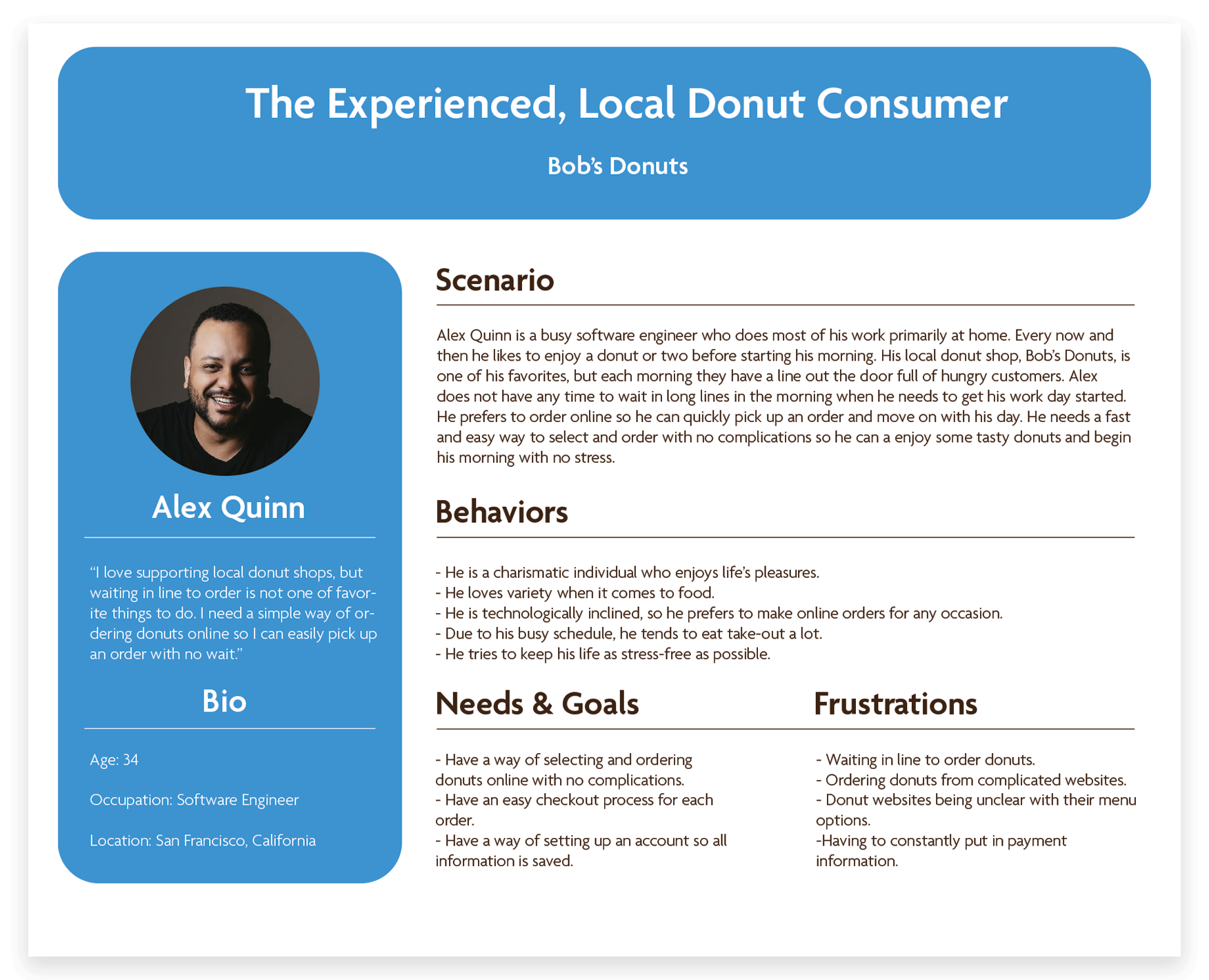
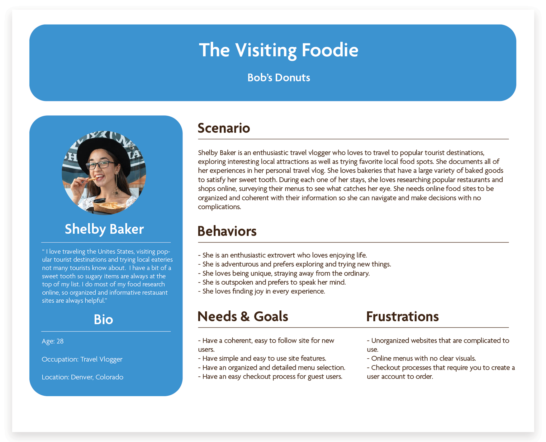
The two user personas I developed are tailored to Bob's target consumers. Customer #1, represented by Alex Quinn, is a local and frequent customer who is knowledgeable about donuts. Customer #2, represented by Shelby Baker, is a tourist customer who is interested in trying visually appealing donuts.
Reviewing Bob's Donuts Current Site
After creating user personas it was time to focus on Bob's existing site. Upon conducting a thorough review of Bob's Donuts' website, certain complications were identified that needed to be addressed.
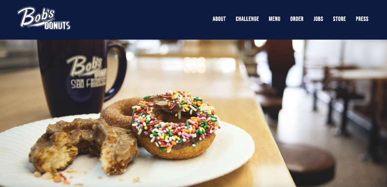
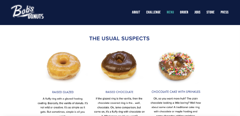
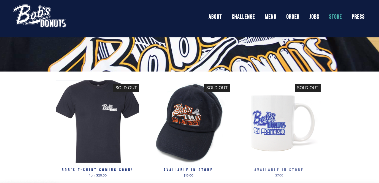
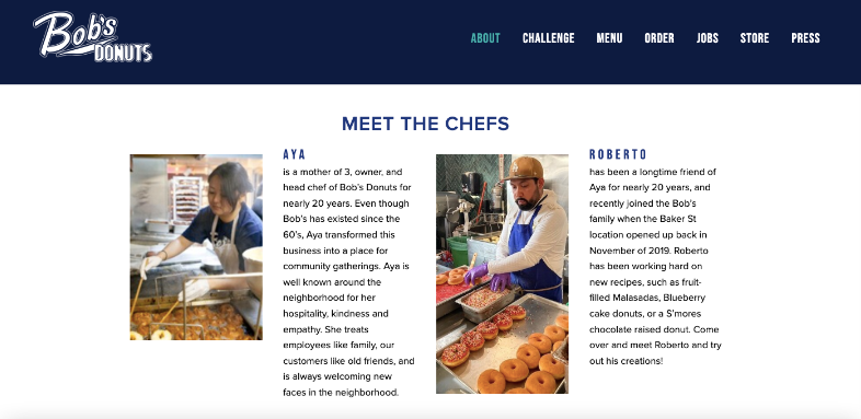
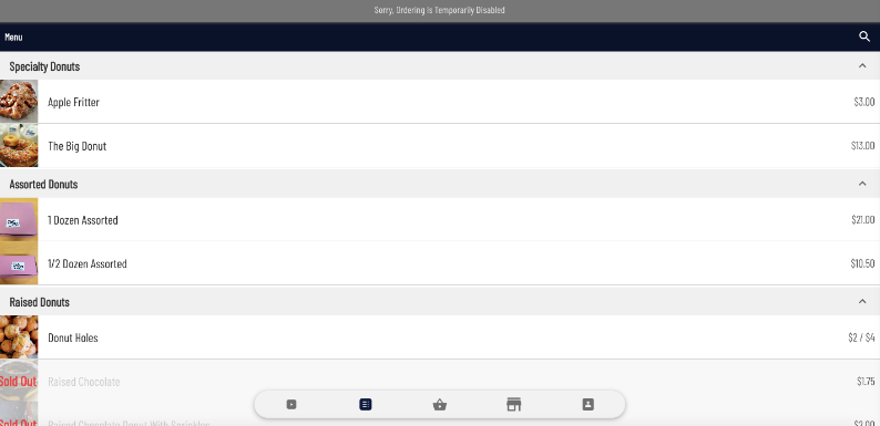
Bob's site has 2 different ordering links. One that is disabled but still left on their site (first) and one that connects users to Uber Eats (second).
Ordering Complications
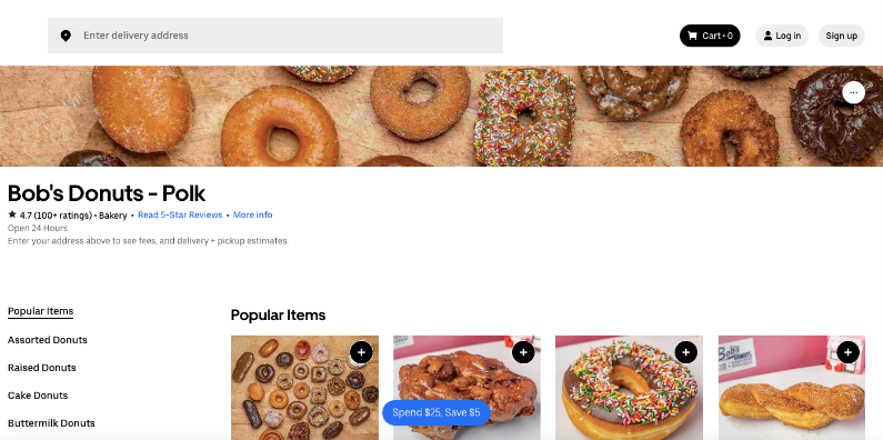
The website exhibits two issues that may adversely affect user experience. The first issue pertains to two ordering pages, one of which displays disabled ordering features while remaining accessible on the site. The second issue involves the website's primary ordering links directing users to Uber Eats, a separate platform for ordering, which complicates the overall ordering process for customers.
Comparative Analysis
As part of the research phase, a comparative analysis was conducted to evaluate the strengths and weaknesses of Bob's Donuts' website in comparison to its competitors' sites.
Most of the competitors I examined are based in San Francisco, with one located in Los Angeles.
Comparative Analysis Insights
After conducting a comparative analysis of several competitors in the area, it was found that most had simpler site structures than Bob's Donuts. However, some shared navigation complications, such as too many confusing links for ordering. While the designs were visually clean, they lacked a unique art direction. The one out-of-town site had excellent structure and organization, but suffered from information overload due to the abundance of visuals and text. Despite their imperfections, all competitors provided a better ordering experience than Bob's Donuts.
The Solution
Following my preliminary research, a clear solution emerged.
In order to prevent long waits, it is essential to optimize the online shopping experience for Bob's Donuts customers. It is important to establish a website with clear and visually-driven content, and intuitive navigation, as well as providing a flexible checkout process that caters to both first-time and repeat customers.
A New Direction
To enhance the online user experience for Bob's Donuts, my focus was on the following aspects:
1. Developing a strong and cohesive design for their website.
2. Structuring the navigation and site pages in a coherent and organized system.
3. Creating a more efficient ordering process for new and returning customers.
Rebranding & Visual Design
To establish a more visually consistent brand identity for the business, the initial phase involved a redesign of their logo.
After analyzing the current logo, it was noticed that the design could be interpreted as misleading, with some individuals confusing it for a logo of a sports team. This observation was corroborated by feedback received from individuals who were presented with the logo.
To update Bob's logo, the process involved brainstorming various ideas by sketching and digitally constructing them to create a clear vision. It was necessary to ideate a new design that would differentiate the business and provide a contemporary and revitalized appearance.
The New Logo
The updated logo enhances the brand's image with a vibrant and cheerful presence while retaining the original color scheme. Its minimalistic design allows for a more visually clean web structure.
Focusing on the Website
Prior to the website restructure and redesign, it was necessary to conduct an inventory analysis and determine the most effective organization of all items available for sale on the website.
Organizing the Inventory
(The best part of the project!)
(The best part of the project!)
It was important to present the full range of Bob's Donuts' delicious pastries and baked goods on their website, including those that were previously missing from their menu of options, particularly on their Uber Eats page. To effectively organize Bob's Donuts' extensive range of products, the most suitable approach would be a card sort.
The Card Sorting Process
During the card sorting process, I presented participants with a comprehensive list of all the items available for purchase at Bob's Donuts, and asked them to organize them in a way that made sense to them. Through this process, I gained insight into how users categorize and structure information on the site.
The card sorting process was conducted via Optimal Workshop. Participants electronically organized site items into appropriate categories.
Card Sorting Takeaways
Based on the data collected from the card sorting exercise, it was evident that a majority of the participants shared commonalities in the way they categorized and grouped items together. The analysis of the card sort results allowed me to gain insight into how the site's items could be organized to enhance the user experience. Fortunately, the majority of participants found the card sorting process intuitive, particularly since the majority of the cards corresponded to food items, which were relatively simple to categorize.
Site Mapping
After analyzing the card sort data, I started working on the new website's architecture with a goal of making it simple and user-friendly. I wanted to ensure that users could easily navigate the site without feeling overwhelmed or frustrated.
Bob's Current Site Map
After taking a closer look at Bob's current site map, I realized that there were too many navigation links and the two ordering pages were not meeting the users' needs, leading to a frustrating experience.
Bob Donut's current site map
The revised site map is centered on the primary objective of the target audience, which is purchasing donuts. It maps out the process that the user will undertake in order to accomplish this desired outcome.
New site map
Focusing on User Flows
After finalizing the site map, the next step was to establish the different user journeys that would take place within the site. To accomplish this, I developed two distinct user flows that align with the two user personas I created for this project: Alex Quinn and Shelby Baker.
User Flow 1
User Flow 1
The first user flow outlines Alex Quinn's journey as a regular customer of Bob's Donuts who has an account on the website with all his saved information, including payment details. To place an order, Alex simply accesses the site (logged-in), clicks on the shortcut link to the ordering page, selects his order, and checks out. Since he has already registered, Alex can complete his order much faster and with less hassle.
User Flow 2
User Flow 2
The second user flow outlines the journey of the second user persona, Shelby Baker, a foodie tourist visiting Bob's Donuts for the first time, and interested in exploring the full range of options available. Shelby's path involves accessing the site, browsing through the menu, navigating to the ordering page, selecting her preferred donut, and completing the checkout process as a guest since she chooses not to create an account.
Design Phase
After defining the user journeys, the next step was to ideate on the layout for the website's webpages. To accomplish this, I employed a variety of techniques, including creative brainstorming, web layout sketching, and wireframe/wireflow creation, to arrive at the final design structures.
Wireflow of User Flow 1
Wireflows
I developed two wireflows, each representing the distinct user paths in this project, exploring different journeys through the site. Each pathway features two distinct methods of ordering and checking out on the site
Wireflow of User Flow 2
New Homepage Layout
The updated web layout has a cleaner, modern, and more playful feel to it. The new branding has resulted in a cohesive design that is easy to navigate.
The website's new minimalist structure and brighter design will allow users to easily navigate and find what they are searching for, eliminating any confusion or frustration.
The Prototype Phase
During the prototype phase of the project, the wireflows that were created during the design phase were transformed into a functional prototype. The prototype was developed to showcase the two user flows that were designed for the project.
The Testing Phase
During the testing phase of the project, users were observed using the prototype, and it was found that the majority of them found the site to be straightforward and easy to use. The average completion time for each tester varied between 1 minute and 30 seconds to 3 minutes and 50 seconds, depending on the particular path they were exploring, with just a couple misclicks experienced per test. Each user provided helpful insight on what needed to be addressed in the prototype.
Misclicks and Input
Most of the misclicks occurred on the first page. Users thought the icon designs were clickable features.
Most users made the suggestion of moving the 'Big Donuts' category to the top of the ordering page since it is one of Bob's more prominent items on their menu.
Testing Overview
Overall, the prototype received positive feedback from users who found it to be easy to navigate, with clear and distinct paths that minimized any confusion during the experience.
Next Steps
Based on the feedback received during the testing phase of the project, there are several important next steps that should be taken.
First, to prevent users from accidentally clicking on certain icons on the home page, it is recommended that their prominence be reduced.
Second, to enhance the overall user experience, the "Big Donuts" section should be moved to the top of the ordering page to increase its visibility.
Finally, to make browsing more intuitive and user-friendly, inventory items that fit into multiple categories should be reorganized. These changes will help to ensure that users have a seamless and enjoyable experience while using the platform.
